Arrow diagrams (causal diagrams)
Arrow diagrams are a convenient and very explicit way of presenting a theoretical model, as well as report the empirical results.
 This arrow diagram represents a model and uses arrows to show the direction of the hypothesized relationship between two variables:
plus and minus signs denote positive or negative relationships, use more than one plus/minus sign to note the relative strength of a relationship, where for instance +++ means that you
hypothesize a very strong positive relationship.
This arrow diagram represents a model and uses arrows to show the direction of the hypothesized relationship between two variables:
plus and minus signs denote positive or negative relationships, use more than one plus/minus sign to note the relative strength of a relationship, where for instance +++ means that you
hypothesize a very strong positive relationship.
Note that the absence of arrows between the independent variable means, that your hypotheses postulate that there is no meaningful relationship between them!
 The same diagram can be used to report the empirical results.
For instance if you are using multiple regression to verify the model, get the beta coefficient for each relationship and add them to the diagram, replacing) the plus/minus signs of the
theoretical model. Do not report very small not meaningful coefficients, and remove the corresponding arrow from the diagram. You then can easily compare your theoretical and empirical models
and draw the appropriate solution. Adding the R2 statistics, as well as other important information, like the number of observations and the percentage of missing values, will produce
an easily readable view of your analysis, very handy if you need to compare the model to other, similar models.
The same diagram can be used to report the empirical results.
For instance if you are using multiple regression to verify the model, get the beta coefficient for each relationship and add them to the diagram, replacing) the plus/minus signs of the
theoretical model. Do not report very small not meaningful coefficients, and remove the corresponding arrow from the diagram. You then can easily compare your theoretical and empirical models
and draw the appropriate solution. Adding the R2 statistics, as well as other important information, like the number of observations and the percentage of missing values, will produce
an easily readable view of your analysis, very handy if you need to compare the model to other, similar models.
 Instead of using the numerical value of the beta coefficient, you might also use plus and minus signs instead, where a single plus
represents a (relatively) small coefficient and several pluses stronger relationships. Although these arrow diagrams look identical to representation of a theoretical model, they are of course
very different in nature; clearly labelled, confusion should not be possible.
Instead of using the numerical value of the beta coefficient, you might also use plus and minus signs instead, where a single plus
represents a (relatively) small coefficient and several pluses stronger relationships. Although these arrow diagrams look identical to representation of a theoretical model, they are of course
very different in nature; clearly labelled, confusion should not be possible.
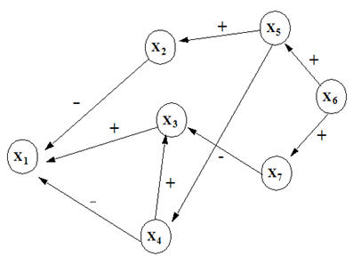 Models can of course be much more complex, as a simple multiple regression model with a single dependent variable; as pictured arrow diagrams
are even more useful for complex models.
Models can of course be much more complex, as a simple multiple regression model with a single dependent variable; as pictured arrow diagrams
are even more useful for complex models.
Link